Tuesday, May 11, 2010
Synethesia
What I intended to achieve with my project was provoke or generate thought concerning the phenomenon of assigning humanistic characteristics to things such as graphics, text, shapes; things that may not necessarily seem to invoke such thoughts at first glance. The choice of format, an informational graphic, seemed like the logical way to represent information concerning such visually associated information. I also hoped to present a great deal of information in an accessible way, which is what informational graphics seem to be designed for. In relation to caricature I felt the most obvious and interesting association was the personification of numbers, letters, even general images in the context of things such as advertisement and entertainment. That relates to a less obvious and more focused association to caricature, that being the specific gender marketing of advertisement and media. The overall, but often obvious manner in which a product's packaging, design, textual graphics and context conform and attempt to appeal to the specific gender demographic.
Saturday, May 8, 2010
Mural
To write a statement about this mural seems, kind repetitive. Also I think the mural was met to speak for itself. It started out as a misrepresentation of Luz and I and how we are different from the cultures that we look like. However by the end of the project it became more about how we personify ourselves, the grotesque and caricature. In the end I wish it was more about misrepresentation, because I do not like the idea of having how I see myself plastered about eight feet by about six feet up on a wall. Try as I might it did become personal and my understanding of the meaning of caricature makes a whole lot more sense. Especially since I know now that it does not need to be funny, but that a caricature can convey stronger meaning.
let them eat cake
This image was intended to speak about the gluttonous behavior of the upper class in America. There has been the issue of the trickle down system not working to help the lower classes. There are many people in the upper class that feel they deserve what they have as do the poor. The starving children in this picture are not just from Africa, but Romania, South America and the various countries afflicted by the Holocaust. There could have been more references in regards to this issue, but I didn't find it nessasary to beat a dead horse. I feel that this is very clear in it's meaning. I don't know exactly how others feel about it because my crit was not very constructive. At the risk of going off on a tangent, I don't think I will talk about the underlying history of this piece. It is obvious that it talks about gluttony and the dispersal of wealth. That is why there are many starving people and only one fat guy. There is no need to know where these children come from to know that this is real and that it is a monstrosity that this is allowed to happen. I guess to some people it may be old news that this happens, but I don't thin k many people understand the magnitude that this happens because not many look up pictures of starving people to realize just how bad it really is, and some just don't care. This is addressing the issue by using the grotesqueness of reality.
Friday, May 7, 2010
political mugs
My original intent of this project was to create a political cartoon. After many failed attempts at trying to create one, I decided to go forth with creating a mug for those who like to show off their political side. A mug is a personal drinking utensil that can be used to express a person's views. I intended that the political animal that had mounted the other to portray that animal's power over other. For example, the cup on the right portrays the republicans getting fucked over by the democrats. However, I have learned from the critique of others that one mug can be viewed to represent both political sides.. it all depends on how you read it. The mugs were a humorous and crude and even almost grotesque way to go about showing your political side.
This class has made me appreciate political cartoons and caricatures in a way that I never have before. This project has done that too. I never really understood until learning the history of caricatures that they really do have a large effect on society. I now look at a caricature much more conceptually and try to read it to it more, which is something i never used to do.
Is English Your First Language?
Mine and Rachels final came together based off of our situations as Americans. Living a dual life, and having to represent who we are in society. The truth in this situation is that we are all going to die, once we are stripped down, not matter what material status we may have we are made up of a structure so simple- so ephemeral. That after life we transcend and become bones the only sure thing in life. While we have chosen symbols which represent our cultural backgrounds, we have also simplified the main images so that it can be interpreted as any one. We are framed in the American flag, because it represents our interpretation of "American Life." We must fit within this paradigm while still trying to retain some of where we come from.
Thursday, May 6, 2010
Alfred, New York, Valley of the Insane
Basically, my project was intened to be a caricature of Alfred, having a laugh at the different stereo types and quirks that make up this town (example: the trashed keystone boxes, art studetns, frat guys...)
I wanted to use sarcasm and irony to connect and pull in the audience and have them relate to the caricature like I did drawing it, in the fact that we all live in this town and understand the various jokes that people from outside Alfred may not.
This class has change my perspective on caricatures and actually value them more that other art that i've studied. I feel like there's so muc thought and meaning submereged in caricature that gets over looked by the public, but I see that now and appreciate the brilliance in caricature.
Wednesday, May 5, 2010
Internet Posters
My goal of creating these posters was to show the ways in which the Internet has negatively impacted our society, and the ways in which our values have changed due to its affect. The Internet is recognized for all the advantages it brings to us, but we have become so dependent on it that its advantages have in turn made us lazy, and incapable of communicating and socializing in a normal setting. In my posters, I decided to focus on the shift in the ways we value relationships, communication, and education, and how these values have been affected/influenced by our Internet use. In the relationship poster, I presented the question of whether or not an online relationship holds the same value as being with some one in person. In my communication poster, I presented the idea of interpersonal communication, and the lack of one on one or face to face contact with someone. In the poster concentrating on education, I focused on the idea of the great amount of miss information you can receive from Internet sources, and the fact that it could lead you in many different directions, rattling off a bunch of nonsense facts. Through this project and class I have learned that caricature can take on so many different forms, and styles. Some are valued for their complexity, and others for their lack of detail or information. It is interesting to see how caricature can be applied to various concepts.
Caricature and advertisement have been sitting side by side on the printed pages of magazines and newspapers for centuries. Both forms of print media borrowing from each other to create a rubric for success. Each requiring that a single image be loaded enough to push an agenda for political and social views, as well as product lines. My intentions of utilizing BP’s new logo and advertisement campaign of “beyond petroleum”, which is intended by the company to show off its new efforts in going “green”, is in fact anything but that. That said, while ads suggest their endeavors in alternative and renewable energy, today alone they have another 200,000 gallons of oil spewing into the Gulf of Mexico. While they spent 45 million dollars merely buying out a solar company called Solarex which can power 1,600 homes with renewable energy, they have done very little else. In 2007 they built a gas station with solar panels on the roof, so that consumers can happily and confidently gas up their SUV’s using eco-friendly pumps, three years later the solar panels are still not operational. Advertisements have long been using any means necessary to misinform, and misrepresent, information hoping to drill brand imagery into the consumer’s minds that their products will in fact enhance your way of life. It is funny to think that examples from past advertisements encourage starting your children on soda at an early age, that doctors “recommend” Camel cigarettes, and mothers should drink Blatz beer as a source of nourishment while nursing their children. Perhaps we will one day see the ridiculousness of oil and gas exploration and excavation companies touting a “green” theme. While they spout off about renewable energy sources, oil is spouting off into our water- damaging reefs, wildlife, coastlines…I find it hard to believe that these things are renewable, and the lives lost by the their last two oilrig explosions certainly are not. This project was a way for me to differentiate between the use of “truthful misrepresentation” and just plain superficial and dishonest modes of imagery.
Texting texting texting
Tuesday, May 4, 2010
Wednesday, April 28, 2010
Pixar shorts have always been a favorite youtube search of mine. I especially love the tennis ball commercial one where there are two tiny birds watching a tennis game being played by two chickens. Then with out meaning to one of the chickens accidentally picks up one of the tiny yellow chicks assuming that it is a tennis ball and bats it across the court. The other tiny chick finds this hilarious and proceeds to text his friends this ridiculous event. The scene cuts to the chicks friends who receive the message and laugh hysterically and then the scene cuts to another group of chicks who are watching a youtube of this event. This gave me an idea on how pixar might depict Laura's and my texting project. Perhaps Pixar would do something by showing the rate of a text exchange and how it becomes misinterpreted over time. Pixar has a Theme of using small verses big characters where there is always a victim who rises to the top. Where the small outcast character becomes victimised and then proves his worth.
Monday, April 26, 2010
Fritz the Cat
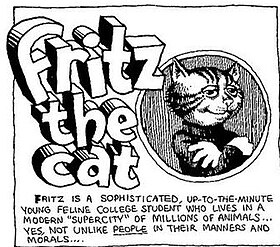
A late entry, I admit, but I do hope it’s still good. In any case, in the past couple days I’ve been looking at the work of R. Crumb. One interesting note, the R is short for Robert. Okay, not so interesting. Also, I may be stalling a bit. But, to get back on topic, I read quite a few strips of Fritz the Cat, a comic by Crumb, and I was quite entertained. The works are violent, sexual, and still very applicable; the formula for good comics, at least, in my opinion.
As the picture states, the comic takes place in a “supercity” – a parody of any big American city, really, but what first comes to mind for readers, and what Crumb was most likely implying, is New York City – filled with anthropomorphic animals, which are basically the personalities of city dwellers. Fritz itself, its also implied, is the inner workings of Crumb’s mind; what he wants to be and say put into the persona of a conning, smooth-talking hipster cat.
The characters still, for the most part, hold true today. Though the situations may not still be exactly the same, I know I’ve witnessed, and even participated, in complaining about people pretending to like the things that I liked long before it was “mainstream” and cool to do so, as a for instance. In an art school, its almost impossible to not hear, if not take part in conversations (read: rampant bitch-and-moan fests) like these.
I found the articles really interesting this week. Julie Doucet’s work was a great example of caricature in the form of comics. In a way I feel she had caricaturized her diary and all its contents. Not only did she successfully caricaturize art school and its clichés, but the very words at the top of each frame, loaded with sarcasm. I feel that the contrast between the words and the pictures is what makes Doucet’s comics successful.
It was intriguing to consider the work of Pixar to be caricature, for I’ve never truly connected animation to caricature, yet everything Pixar makes is basically personification or a caricature of one thing or another, whether it is a car, monster, lamp, snow man from a snow globe, or birds.
Another aspect of Pixar’s work that I hadn’t contemplated was the physiognomy involved in their character design and animation. The article compares some works to Daumier’s drawings, in that taking the physical features or expression and morphing them or having the features suggest something about the character’s personality. The idea of physiognomy is more apparent in animation and cartoons that we give credit for. The very aspect of character design is founded on the same notion. In animated movies, there’s very little time for the audience to get to know the character, thus the animator or character designer’s job is to save time by telling the audience as much as they can about the character visually.
For instance, in Monster’s Inc., Sully has a rather broad frame with geometric but rounded features and is fluffy and bear –like as well as having a smile on his face, thus the impression the audience gets is one of kind-hearted good-guy hero. Mike on the other hand, is short and goofy looking due to his ab-normal proportions (really big head and small appendages) but has circular features, thus the audience knows that he’s the funny side-kick. Yet, Randall, the antagonist of the movie, is very snake-like, and has angular /sharp features with a crooked posture as well as smile, thus the audience feels wary and untrusting about this character.
Mr. Natural
Mr. Natural is a Robert Crumb original which is Crumb's most recognizable work for me. He was created in the 60's as a counterculture icon depicted as a prophet or higher being. His character is a mystic guru who proclaims the evils of modern living and encourages a natural lifestyle. Although he is an icon who preaches good messages, his character has been known to be cynical, moody, self-pittying, as well as condescending.
Pixar Shorts
Sunday, April 25, 2010
Pixar
In regards to the animation production company Pixar I find the most prominent aspect of their feature length blockbuster films is their ability to so impeccably incorporate the personal traits and aspects the celebrity who is playing a character in the film. That is to say that when a character is portrayed in a Pixar film they generally bear a striking and clear resemblance to the person voicing the character, in terms of gestures, mannerisms, personality, and even appearance (One might say a character looks like what you would expect someone with that voice to look like, a topic often relevant with the world of talk radio). For example the rat character Remy from the Pixar film Ratatouille in my opinion bears a striking resemblance to the actor playing him, Patton Oswalt. Of course Pixar is not the only animation producer to employ this technique with great effect, Dreamworks Animation for example also often achieves this (Kung Fu Panda comes to mind). Naturally achieving this type of resemblance suggests a strong and clear understanding of caricature and the types of traits which best portray the essence of a person's general character. This is what I find most impressive about some of the films produced, imagining the difficulty of creating a character bearing resemblance to a specific person while still working within the specific guidelines of that character (creating a car that looks and acts like Larry the cable guy).
A Brave New World
It is interesting to consider how kids today are growing up on Pixar films, when as a child I grew up on the Disney films. I wonder if the change will have a very large effect on the future generations to come.
Disney films are often criticized for being too mushy, or too cliché. The heroines often have barby doll figures where the heroes have six packs; idealism is pervasive through the imagery depicting the main characters.
Though Pixar also pushes the importance of family ties, friendship, loyalty, bravery, and morality, it approaches film in an entirely different way, which not only results in their films being less cliché, but also leads to more complex characters, more humorous plot lines (or a least a strong vein of humor running parallel to a more serious plot). It also leaves greater room for caricature, both of current society as well as its characters.
Disney tends to pick a well known historical (in the case of Pocahontas) or a fairytale (The Little Mermaid) and dramatizes this story. The story is plot driven; the characters are generally flat and straightforward. The good characters may have some flaws that they have to work though but at heart the good characters will always redeem themselves and the bad will be destructive and deceitful. Though Pixar films also have a definite plot they create an alternative world for their characters, parallel in some ways to the human world but not exactly the same. Human characters and situations carried out through the lens of a fish, a car, a toy, a rat or a super hero. There is this curious play between the modern human world and the factious personified world created by the animators, which allows for a commentary or satire on the modern world at the same time as maintaining a distance from it. For instance, the Incredibles is a film about a disillusioned father who is chasing past glories, so that he neglects taking care of his family and spending time with his kids. However, by making him a super hero not only adds another complex layering to the plot, creates lighthearted tone, while still getting a serious touching message across to its audience. We are sucked into the world of aging super heroes’ and amused by characters like the costume designer Edna Mole, and accordingly it is much more tolerable, enjoyable film as an entertainment than a moral tale. It feels less like we as an audience are being preached at, and more like we are being treated to a good laugh.
Pixar’s approach also gives them the liberty to be satirical; like in the Incredibles they criticize the stupidity of lawsuits by having a man sue Mr. Incredible for interfering with his suicide and win. Or in Wally by having the whole human race turn into a bunch of fat emaciated blobs to absorbed in their digital media to notice one another. Because of the ridiculousness of the criticism everyone recognizes the jab but no one takes offense to it, thus the quality of lighthearted fun is sustained.
Everything in a Pixar film is interpreted though a different medium, though the terms of the world they set up. Attraction in the terms of a car, political suppression and propaganda in the form of an energy corporation run by monsters, even the humans are not really humans with their large eyes and rubbery animated skin. This approach allows a well-known story plot line to sustain a high interest in its audience that leads to a lot of play for the animator and entertainment as an audience member.
WALL-E has a very interesting dynamic, with the robot story taking the front while an underlying story of future humans plays out. While the robots are not particularly verbally articulate, there is something resembling a robot love story playing out. The dual story lines help explore possible future issues, while keeping the story somewhat light and fun.
The final scenes of both movies have some aspects that are definitely within the realm of caricature. UP! has an old man fight, where both have back issues, and one spits out dentures as a defensive attack. There is also a dog fight featuring the "cone of shame". WALL-E features a captain/auto pilot fight, which is both amusing and triumphant- the humans of WALL-E are fat and taken everywhere in moving chair/computer things. The captain struggles to stand up, and eventually manages to many cheers. I'm told this seen also references/caricatures a film I've never seen ( 2001: A Space Odyssey).
Animation lends itself nicely to a combining caricature and comedy into stories. Pixar has done a nice job exploring that. I'm quite fond of Ratatouille, Monsters, Inc., Finding Nemo, and the animated shorts I've seen as well, but WALL-E and UP! are the most fresh in my mind. And UP! won as Oscar for best score this year. Very effective main theme.
One Vote 4 Pixar…
My apologies- I lost track of time…Anyways…I am interested in Pixar. I really enjoy taking my younger cousins to see these movies, as they are so easily accessible to children of all ages. I love how they include jokes for adults as well- I never understand why a fish belching is THAT funny, and yet my cousins don’t get what was funny that made me laugh. Since Pixar is creating these characters from top to bottom, artist get to decide everything from there look, clothing, quirks, voice, everything- they can make each character become the best possible version of itself. Cartoon and animated characters are great for this reason, they are not simply playing a role that will change in the next film, and they are very easily recognizable as themselves. And who doesn’t love Pixar outtakes? Now that is seriously funny.
The New York Time’s review compared the works to Daumier and Messerschmidt’s modeling, and as I thought about it I would have to agree. The facial characteristics that Pixar utilizes is often a very clear indicator of the character’s disposition, and I feel that this exaggeration of face helps to anthropomorphize this fish/monster/car so that we can truly enjoy each of the unique qualities that where created for each character- as well as the film as a whole.
Black and White
I was visiting my friend in Ohio, and we went to the Akron art Museum. There was this one piece that stuck out in my mind and that I think correlates to the reading. Unfortunately, I’ve been searching for it all day and I just can’t find it. I’m sorry! I’ll describe it to you. It was a very simplistic piece. It hung on the wall and was white lettering, set against a black background. It had the word white and then the word black on it with their respective definitions. White- the color of milk or fresh snow, the opposite of black, free from color, free from spot or blemish, morally or spiritually pure innocent and untainted. Under this definition ran the definition for the word black: black- the very darkest of color, the opposite of white due to the absence of light, dirty, soiled, characterized by hostility or anger, full of misery or gloom, very evil or wicked, connected to the devil. That was it.
Not only do we overuse the word grotesque so as Paseo de Peralta suggests, it becomes a jaded slang term in our general repertoire of vocabulary, we also use it in a very single minded way. In general the term grotesque is used so that it is synonymous with the word disgusting, however it is more complex than we give it credit for. Grotesque however can also mean disordered (out of place), unique strange. Peralta mentioned that there must be a contradiction involved for something to be grotesque. Also, that “ that conflict must already exist within the mind of the beholder such that the confusion stems not only from the anomaly to which we bear witness in the world, but the anomaly that is revealed with in us. I think this is why we are so compelled, so sated by the grotesque, at the same time as being disturbed by it. It’s always satisfying to have an emotion we have felt represented well in a phrase we read or in an image we observe. It gives us something physical that we can relate to, something on the outside, visceral world that our elusive internal states can reach out and clutch onto, so that they themselves can achieve greater density and reality and become less like air. There is solid evidence that our emotion exist beyond our whimsical fancy that it may do so. Accordingly, we are drawn to the grotesque we encounter, for it is an extreme version of the grotesque within.
I consider the art piece in the Akron Art Museum to be grotesque for precisely this reason. On seeing the word black and white paired up right next to each other we make them representative of people instead of just colors or words. One becomes all too uncomfortably aware that the words absence of light, soiled, and evil being associated with the term black and the terms pure spotless and light being associated with the term white. Also they are set up as opposites, which work for colors but not for people. On one level they are just definitions for words: He was black with rage, her sole was white and pure. However our knowledge of Caucasians mistreatment of African Americans in this country: slavery, to segregation, to African American (as well as other minority groups) continued quest for equality, makes those two words charged. One asks: is black connected with evil merely because we can not see with the absence of light, and accordingly we distrust the dark, or is it proof that our language itself holds hidden prejudices on what it means to be a dark skin or light skinned. The piece is charged in our minds because of our history as Americans and our knowledge of that history, we have grown up with the minority acts and stories of cops type casting African Americans, or bosses who are sued for firing an employee based on race. It is a sensitive topic in our error and almost magnified in our minds due to our constant awareness of it, and efforts not to offend anyone.
The piece is particularly effective because it causes us to question ourselves. We start to feel guiltily that our minds jumped to race and people when the piece was only referring to a word. Do people use these terms as proof of racial superiority? I use those terms, am I then prejudice because I recognized these words as people instead of just words. But I don’t believe these definitions are true on any level in reference to people? Do I believe I am superior on any level? Prejudice here is the grotesque, and its brought to us in this rather second hand way though the use of two words and their respective definitions, our mind however makes the jump connecting the two. It strains toward the word prejudice as well as steers away from it with an equal intensity. It’s almost a coal, too hot to touch, so that in the end we have are afraid to look at our own thoughts on the subject, afraid we may find a monster there.
Pixar Growth
Pixar has come a long way not only in animation technology but story structure too. The first movies that gained them popularity was a Bug's Life and Toy Story. Although these movies had definite themes and development they only scratched the surface of deeper messages. The same with the Incredibles a lot of conformity of the 1950's and the study of uniqueness, these are big themes but the endings leave only half digested ideas for movie goers, especially the children that are the target audience.Ratatouille was the first major step to a complete theme because it was movie that taught that a man or rat can become anything he wants to be and overcome obstacles.
Pixar is company that has continually grown in ideas and concepts for animation entertainment. Studios like Dream Works reached new heights with movies like Shrek, but have not maintained a steady progression and increased sophistication within movies. In comparison Dreamworks are Cheetos against cheese on cracker with Pixar. Pixar in the forseeable future will continue to create more significant media and surprise us with better stories than before.
Julie Doucet
Her New York Diary is a direct representation of life and its ups and downs. I read the situations of this girl Jewels- and she seems to be caught in situations of school, life and relationships- how is this grotesque? She has fairly odd dreams and the images may at times are intense the people she comes across are at times extreme- even the sudden urges that she comes across on the daily are taken into consideration within her dreams.
Her comics are of both worlds- the realistic and fantasy/ grotesque. That way the reader/ viewer can feel a connection subconsciously. The understanding of real life and the crazy reactions that are thought but never acted upon- which are shown then are translated into a dream like state of this character Jewels. As stated in the packet " first our own uncertainty about what we really think and how much we actually wish to reveal." Her exaggerated figures are representative of her highly stylized eerie environments- they balance one another. The line is an important tool that she uses well, it allows her to highlight or accentuate certain features on her characters or within the atmosphere of the frames.
This comic series is her voice, a form of freedom in which she shows the life of this character as a "series of contradictions," and as the storyline continues the reader becomes engaged- and continuing to read on the ending is usually an abrupt stop and we are snapped back into reality.
Pixar
I watched the animated, and X rated, 1972 film Fritz The Cat, a creation of R. Crumb's. I was not prepared for this film. I'm just going to write about it and hope something coherent comes out.
I loved this fucked up little film. I was also at times shocked and horrified by it. It doesn't hold back and doesn't care who it offends. It is a merciless parody of the 1960s which is psychedelic, pornographic, and disturbingly violent, yet filled will philosophical social commentary. Fritz is all about sex and drugs, but starts to get idealistic, starts a race riot, characters get killed, characters get raped, he gets involved in terrorist activities, and in the end he's still all about sex and drugs. It's a comedy.
Fritz himself represents a 60s college student, a poet, and is very socially idealistic. Which means he's an ignorant, cliche revolutionary, who just wants to get high and fuck. That's they way Crumb realizes the character, with only "a little" cynical truth to it. It's a very unforgiving look at the wanna-be college hipster types.
The way the film, and Crumb, comment on racism is very interesting. All blacks are represented as crows, which is a way to mock the Disney stereotype caricatures of films like Dumbo. The main focus of the racial commentary is on white people's pretentious attempts to identify with blacks and "act cool" by idealizing and acting out white perception of black behavior. Fritz even gives a little speech about white guilt. It ends with Fritz exciting a riot between the crows and the pig caricatured police and getting a lot of crows and pigs killed.
Sex is everywhere in this feature, as it is central in Crumb's work. Fritz is a sexist, and views women as sexual objects or bitches. The only time he seems to sympathize with a woman is after he sees her get beaten and raped. I do believe the film is critical of sexism, yet it does celebrate sexuality from a sexist male perspective. The women are rarely seen as positive, independent, or strong characters. So it's criticism of sexism comes off very weak.
I did enjoy the films irreverent take on 60s characters, and I also loved its biting analytical criticism. There were things which genuinely disturbed me, and jokes I just couldn't laugh at. I think this is an important cultural film, and I think intelligent people should watch it, think about, and have fun with it.
pixar
When compared to the subversiveness of the Simpson's and South park, Pixar movies were described as an "urge toward conformity." These two cartoons are successful due to their ability to shock the audience with their depictions of an often uncomfortable reality. They present controversial stereotypes, moving away from any sense of conformity or 'aim to please.' And yet, their sense of rebellion excites society, pleasing them just as much as Pixar's sense of conformity.
It is interesting to see these two types of caricature, take such opposite means of being successful, and continuously entertaining.
Julie Doucet insights
Her naivete shows through in NY Diary, as she makes her way through art school and the banal activities they make her do. She waits until the very last minute to fill her sketch book and reflects on all of the experiences she has had during the semester. It is interesting to see how excited she is at the beginning but it quickly wanes as the comic goes on.
In her comic the Madam Paul Affair she tells a story that happened to her but from an outsiders point of view. She seems to take the cynical view as well and points out all of the things that goes wrong in her life. Such as the struggles with her boyfriends to school work. In the comic about her break down she even uses the grotesque to highlight and emphasize her frustrations with her job. She uses odd looking human like figures that are popping up from the ground.
Doucet makes her comics funny with the way the figures are drawn and overly exaggerated, but also makes them relate able in that they describe reality. Her work is dark and black and white with a strong line quality and has to do with human interaction. The strip above highlights her cynical world view insight into the world around her.
Thursday, April 22, 2010
Grotesque caricaturist Ralph Steadman
Reading about grotesque imagery, doing and edcation assignemnt, and Monday discussion made me relook at Ralph Steadman. He is a Biritsh caricaturist and cartooninst most famous for his illustrations of Hunter S. Thompson.
On Monday when we looked at the image of the Sopranos and whether it was a realitic scene or not, I reasoned that it was. Realism is an image that draws upon the physcial likeness of our world and then adds an agenda to the image. We couldn't consider the Soprano picture with bodies on the beach as real because dead bodeis everywhere is not something people can concieve as possible unless they witness a massacre.
Ralph Steadman at one point in his career experimented with drugs and his drawing style developed a new psychedelic medium. When people see his drawings they asume a surrealist drawing is in front of them. But Steadman like all his literary drawings, draws from the discritpion of the writing he works from. Hunter a rabid drug user had his experiences altered by trips and hallucinations. But to Thompson such visual effects were reality. By processing the experience and creating as a picture isn't Steadman creating a realistic image? Read the story and look at the picture and the event seems concievable. With Hunter's text the picture looks like ficition.
Steadman's redenring of figures is certainly grotesque in that the human body is not celebrated in any way romantically and is beastly and deforemed by paniced sensations. But this grotesqueness is what the truth is of the matter and the way we relate to grostesque imagey is relevant to how we are attached to story.
In DieHard if John McClane is shot I don't feel a sickening reaction because I can only bond with him at one level of his situation. In the film Audition the main character at the end of move is tortured and it becomes more personal because you know his desires as the film progresses and his pain is slow and graphic.
People only react to grotesque displays based on how much they believe in them. If there is little inference then the scene of violence is ignored as fantasy and not absorbed as a full moment.
Monday, April 19, 2010
Art School Scum Special - the graduate
Going to school for a BFA is a scary thing, at least for me. To this day, I wonder if my degree will be worthwhile or simply laughed at. With so much seemingly more important issues going on in the world, I wonder, where does art fit in? In this cartoon, the student graduates from art school. His dream is to be a big time artist, but he never seems to get around to making that dream happen. Straight out of school he takes a minimum wage job at a coffee shop and in the back of his mind he is always thinking, "I was going to be an artist." This is a very legitimate fear of mine, to be cursed with the unfulfilled dreams of being an artist. For some, this fear will be the ultimate downfall of their career. As for me, it will drive my work to insanity (which will make me famous... at least that's the idea).
Not always. It certainly is more likely to contain the bizarre visual appeal of the grotesque, rather than the visual appeal of beauty- largely because the grotesque is more useful in getting a message across, and caricature tends to be full of exaggerations, which bring it in the direction of grotesque-ness. But while certainly being somewhat akin to the grotesque, it also often does not actually reach grotesqueness. At what point should we call something "grotesque"? The word is apparently over-used to the point where the meaning starts to become muted. I certainly have a tolerance built up when it comes to seeing grotesque images. If a caricature contains that strange visual appeal of something that is not beautiful, yet does not truly horrify us, is it still grotesque?
This James Gillray caricature is creepy, though not horrifying. The figures, while not beautiful, are oddly fun to look at. Is it grotesque, or am I merely overusing the word?
Culturally misleading
Sunday, April 18, 2010
Grotesque, Caricature, or something in Between
Just as a balance to show that grotesque doesn't always have to be disgusting in art, this George Grosz painting "Amalie" shows the lighter side of extreme exaggeration. Exaggeration of exaggeration or exaggeration for its own sake is also referred to as grotesque art. The use of simple objects and shapes to create a portrait is an interesting relationship to the print collages done by Richard Hamilton.
Texting Etiquette
Music Video/Rock'n'Roll History Homage.
http://www.pp2g.tv/vZHh6ZnQ_.aspx
For their 2006 album, Stadium Arcadium, The Red Hot Chili Peppers made a music video for their hit song, Dani California. The video was directed by Tony Kaye, director of American History X, and features the band in segments that highlight the evolution of rock music. The band impersonates specific figures as well as eras/styles of rock music. The film quality and appearance is also a direct parody of the times selected. The music doesn't change, so the band uses costumes and mannerisms to pay tribute to the bands of rocks past.
The video starts off with curtains opening with grainy 50s era style footage. The lead singer impersonates Elvis' physical mannerism, while the music and voice is the Peppers'. The band does not just represent Elvis', but styles of bands of that era of music, by their haircuts and mannerisms. Then the video transitions to the Beatles impersonation, the drummer stands out here, copying Ringo's mannerisms exactly. Then it goes to the first color segment, in full psychedelic power, impersonating 70s era personalities like Jimmi Hendrix. Another segment dedicated to the 70s rock scene in general, the scene reminds me of the Rock Band game, which features this song. Then to a David Bowie segment, glam rock get-ups with the bassist looking like Bowie instead of the singer. Then back to black and white with a Sex Pistols segment highlighting 70s Punk era. Jumping into the 80s with goth rock with the singer made up with a devil-lock hairstyle, signature hairstyle of Glenn Danzig from the The Misfits. Then the segment featuring Hair-Metal, the heavier 80s version of Glam, with the band dressed-up like Poison or Motley Crue. Cut to the candle lit Nirvana parody, which is my personal favorite, getting through the 90s grunge era. Finally the band gets up to date, with the band being themselves, but the singers outfit does suggest Green Day.
The rest of the music video takes place in the modern era with pieces of the past eras cut in. Though tribute impersonation, the Peppers' show the history of their medium. This is caricature as homage. The Peppers' are very aware of what came before and their own place in rock music. To me that makes this one of the best music videos ever made.
we have gone too far and not far enough...
I think about this all of the time. Did you know that science knows more about the surface of the moon than it does about the deep sea? Humans are, by nature, very curious animals. We want to know why things work and by doing this, we can progress as a species, as we have been doing for centuries. Curiosity killed the cat is an expression that comes to mind. Is it possible that our own curious nature will be the downfall of us? Maybe if we don't learn to help those in need and try to solve issues that are already eminent, we will lose touch and fall into a place of ultimate doom. Yes, I know this sounds a bit dramatic, but if you think about it, we are a bit backwards. NASA spends billions and trillions of dollars on research to go to Mars and explore Europa and figure out when and impact of an astroid will occur that will threaten our existence, but what is the point of all of this when we can't even ensure proper lives to the habitants of our planet, regardless of astroid or not. How can we even think of settling on another planet when we can't take care of our own? This earth is so beautiful. It really is extrordinary just how fortunate we are to live and be human so we can experience the planet in it's entirety. Every time I walk outside, I try to soak up the beauty, not matter if it is raining, snowing or a sunny day without a clou in the sky. Aren't we lucky that the sky is so blue and the plants are so green and that water can reflect that? Why are we searching for greener grass when we have it all right here? I understand the need to satisfy curiosity of the unknown, but no matter how strong that desire is, how can we abandon our own? There are people starving to death every day. There are a sleu of problems that need fixing and there is a lack of money too. Maybe we should curb our curiosity for just a while and use our other humanly capability; compassion. It is in us as a species to fix what we have done and make our species thrive in conjunction with the thriving of the planet. If we don't try to fix what is wrong here, then what is the point in caring if the sun explodes or an astroid smashes into us? Curiousity killed the cat.
How is this allowed to happen?